Animation plays a crucial role in enhancing the user experience of modern web applications, bringing them to life and avoiding a flat and static appearance. However, implementing animations can be a challenging and time-consuming task, especially when dealing with multiple components. In this article, we will explore how AutoAnimate, a lightweight and zero-configuration animation utility, allows you to effortlessly add smooth transitions to your React components with just a single line of code.
What is AutoAnimate?
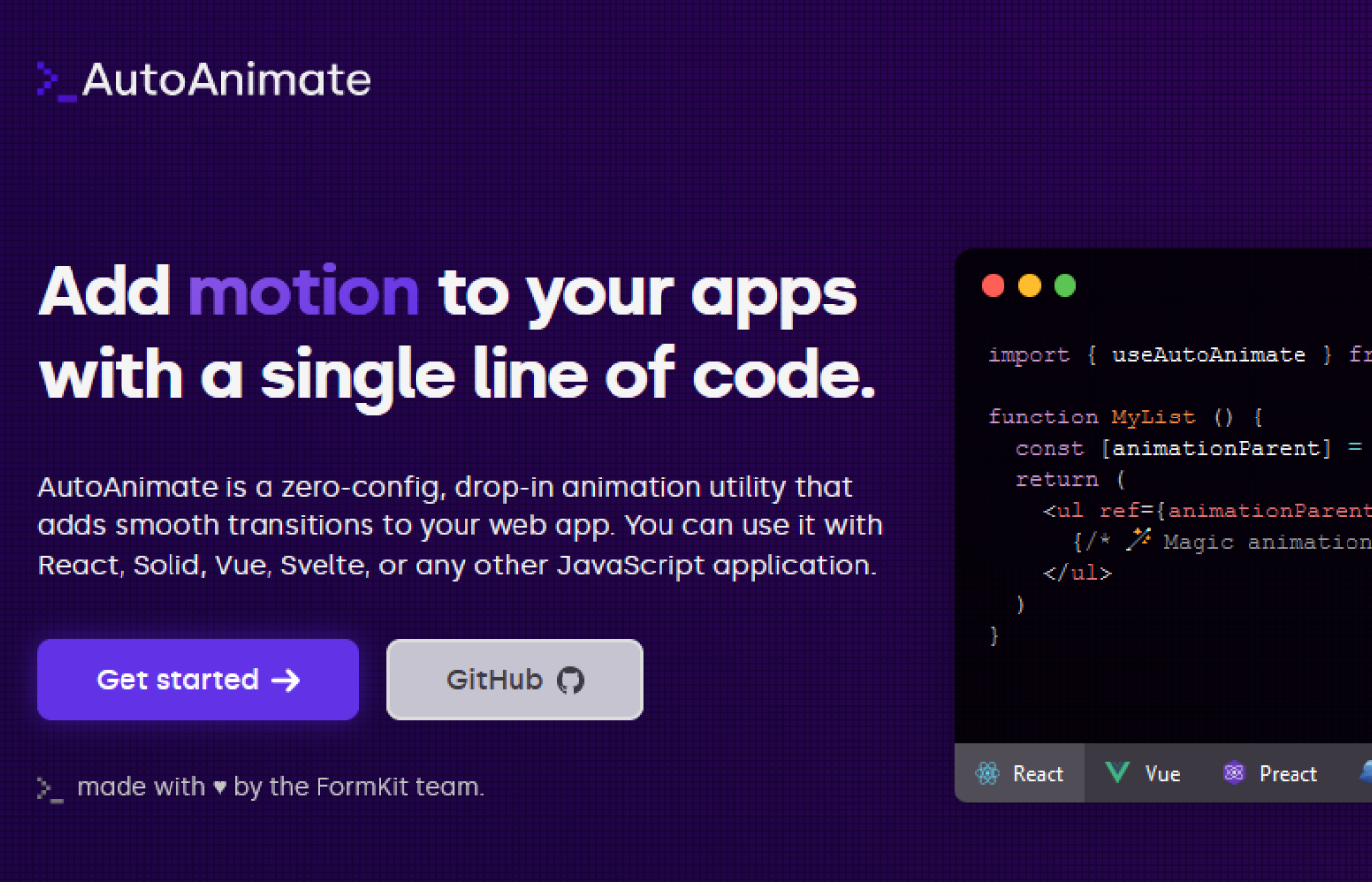
AutoAnimate is an open-source animation utility library specifically designed for React applications. With a focus on simplicity and ease of use, it provides smooth transitions to React components, all while being lightweight, weighing in at just 2.3KB.
Why Choose AutoAnimate Over Other Animation Libraries?
While there are several animation libraries available, AutoAnimate stands out due to its simplicity and minimal configuration requirements. Unlike many other libraries, AutoAnimate does not require extensive configuration or changes to the existing component structure. It seamlessly integrates with your existing codebase, making it quick to implement and ensuring a smooth user experience when elements change in the DOM.
How Does AutoAnimate Work?
AutoAnimate operates on a single-function utility that takes the parent element of the component you want to animate as a parameter. The animation is then applied to the immediate child elements of the parent element. AutoAnimate triggers the animations when specific events occur, such as component entry or exit.
Using AutoAnimate with React
To illustrate the power and simplicity of AutoAnimate, let's compare it with another animation library, React Transition Group. We will create an alert message using both libraries to highlight the differences in configuration and ease of use.
With React Transition Group:
- Import the necessary dependencies.
- Wrap the component that needs to be animated with the appropriate transition components.
- Configure the animation behavior and properties.
- Implement event handlers and manage state to trigger the animation.
With AutoAnimate:
- Import the AutoAnimate library.
- Add the
useAutoAnimatehook reference to the parent element of the component you want to animate. - Enjoy smooth animations with zero additional configuration.
Getting Started with AutoAnimate
To demonstrate how to use AutoAnimate, let's create a simple example of animating a button on click. Follow the steps below:
- Install AutoAnimate:
npm install auto-animate
- Import AutoAnimate in your React component:
import { useAutoAnimate } from 'auto-animate';
- Define your component and wrap it with the useAutoAnimate hook:
const App = () => {
 const [isClicked, setIsClicked] = useState(false);
 const ref = useAutoAnimate({ duration: 500 });

 const handleClick = () => {
   setIsClicked(true);
 };

 return (
   <div>
     <button ref={ref} onClick={handleClick}>
       {isClicked ? 'Clicked' : 'Click Me'}
     </button>
   </div>
 );
};
Run your React app and see the animation in action.
Explanation:
Let's break down the code above to understand how AutoAnimate works:
- We import the
useAutoAnimatehook from theauto-animatelibrary. - Inside the
Appcomponent, we define a state variableisClickedand a referencerefusing theuseAutoAnimatehook. - The
refis assigned to the button element, which we want to animate. - We define a
handleClickfunction that updates theisClickedstate totruewhen the button is clicked. - In the JSX, we conditionally render the button text based on the
isClickedstate. - When the button is clicked, the
useAutoAnimatehook triggers the animation on the button element.
Customizing AutoAnimate
AutoAnimate provides customization options to control the animation behavior. For example, you can specify the animation duration, easing function, and delay. You can pass these options as an object to the useAutoAnimate hook. Here's an example:
const ref = useAutoAnimate({
  duration: 1000,
  easing: 'ease-in-out',
  delay: 200,
});
Conclusion
AutoAnimate is a lightweight and easy-to-use animation utility for React that allows you to add smooth transitions to your components with minimal configuration. By using the useAutoAnimate hook, you can effortlessly animate elements based on various events, such as button clicks or state changes. With AutoAnimate, you can enhance the user experience of your React applications and bring them to life with smooth animations.
Note: AutoAnimate also supports other JavaScript frameworks such as Vue, Angular, and Svelte. For more information and examples, refer to the official AutoAnimate documentation.